The Personalization Gap: Why Shoppers Abandon Custom Products (and How to Fix It)
- Xènia Escolar

- Feb 3
- 2 min read
Personalization is one of the biggest strengths of photo products — and one of their biggest challenges.
Shoppers love the idea of creating something unique. But too often, that excitement fades somewhere between choosing a product and completing an order. The result? High intent, low conversion.
This disconnect is what we call the personalization gap: the moment where customization becomes friction instead of value.
Understanding where this gap appears — and how to close it — can make a significant difference to both conversion rates and customer satisfaction.
Where Shoppers Drop Off During Personalization
Abandonment rarely happens at the start. Most shoppers are motivated when they click “Create” or “Personalize.”
Drop-off tends to happen when:
The process feels longer than expected
Decisions pile up too quickly
The editor feels complex or intimidating
Feedback (like previews) is slow or unclear
Personalization doesn’t fail because customers don’t care — it fails when the experience asks too much, too soon.

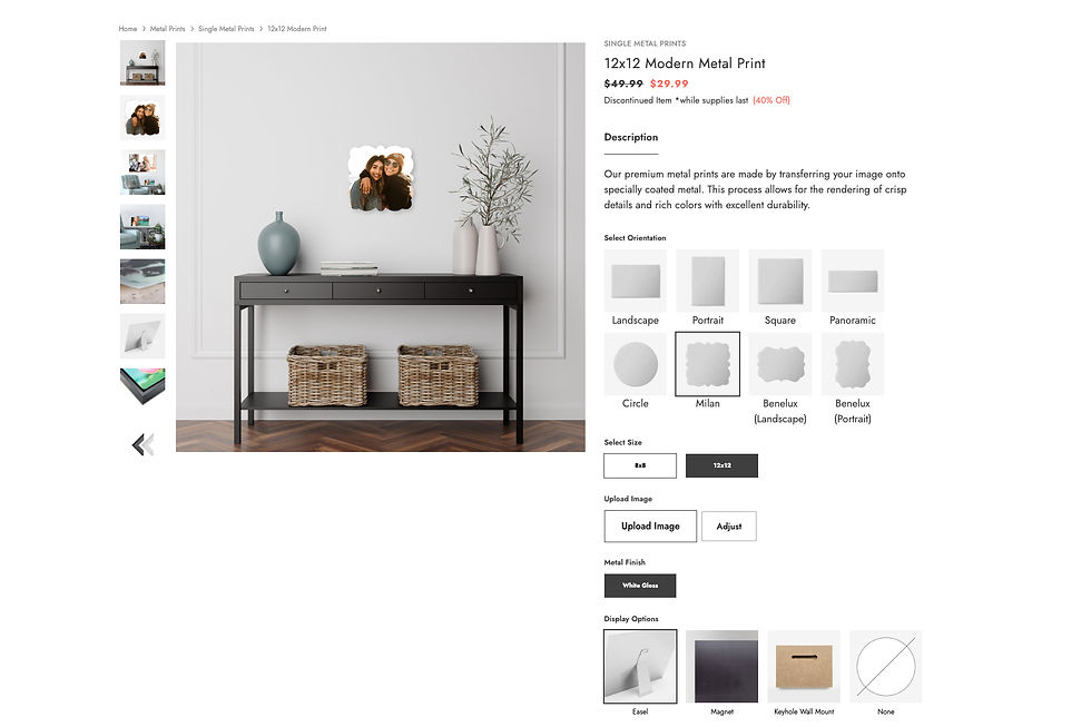
Too Many Options vs. Guided Choices
Choice is powerful, but unlimited choice can be overwhelming.
Common issues include:
Too many layouts, fonts, or formats presented at once
No clear “best option” or recommended path
Equal weight given to advanced and basic options
For many shoppers, especially first-time buyers, freedom without guidance feels like work.
What helps instead:
Clear starting points (“Most popular,” “Quick to create”)
Pre-curated templates for common use cases
Progressive disclosure (advanced options later, not upfront)
Good personalization doesn’t remove choice — it structures it.
When Editors Feel Overwhelming
Most shoppers are not designers. Yet many personalization tools are built as if they are.
Overwhelming editors often include:
Dense toolbars
Too many visible controls
Unclear hierarchy of actions
Little contextual guidance
When customers don’t know what to do next, they pause. And pauses often lead to abandonment.
Better experiences focus on:
Simple, focused interfaces
Clear next steps
Smart defaults that already look good
Guidance that feels supportive, not restrictive
The goal is confidence, not control.

Slow Previews and Unclear Feedback
Nothing breaks momentum like waiting.
Slow-loading previews, unclear crop warnings, or uncertainty about the final result introduce doubt at exactly the wrong moment.
Shoppers start asking:
“Is this how it will actually look?”
“Did I do this right?”
“What happens if I continue?”
Uncertainty kills conversion.
Closing the gap means:
Fast, responsive previews
Clear visual feedback
Simple explanations when something needs adjustment
Reassurance before checkout
Confidence is built through clarity.
Fixing the Personalization Gap Starts With Empathy
The most effective personalization experiences are designed around how people feel, not just what they can do.
That means:
Designing for non-designers
Reducing decision fatigue
Guiding instead of overwhelming
Making progress feel easy and visible
When personalization feels intuitive and supportive, shoppers don’t just finish their orders — they enjoy the process.
Final Thoughts
Personalization should feel like an opportunity, not a challenge.
Closing the personalization gap isn’t about removing features — it’s about removing friction. When customers feel guided, confident, and supported, they’re far more likely to complete their order and come back again.
Because the best personalization experiences don’t ask shoppers to work harder.
They make it easier to create something meaningful.


Comments